|
|
Post by Scott Crawford on Mar 9, 2009 21:56:13 GMT -6
Thanks to a friend who is volunteering his excellent computer graphic artistry, we will soon have new logos for LAprepSoccer.net. I'm going to need your help in choosing which one you would like as the primary logo, and in which colors. Edited: These graphics were created by Andres Lugo. He is a talented graphic design artist, and if you ever need something designed, please remember to check with him first. His email address is djknightshadow@yahoo.com and his website with portfolio is creativehotlist.com/alugoHere are the new graphics. Please comment on which one you like the most and the second most. Also comment on what colors you like. If you think the graphics would look better in different colors, state which colors you would prefer. 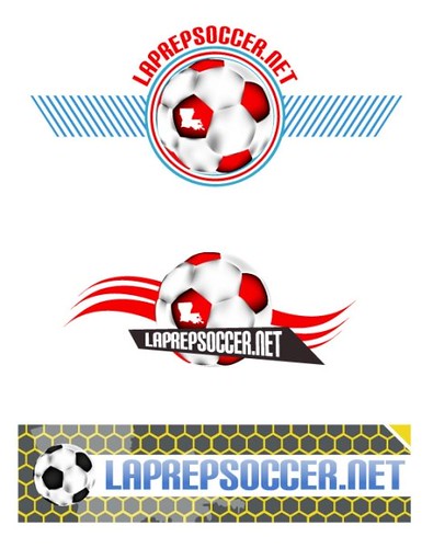 |
|
|
|
Post by Scott Crawford on Mar 9, 2009 22:09:06 GMT -6
|
|
|
|
Post by soccergsp on Mar 9, 2009 22:16:29 GMT -6
I like #2, but would like "LAPREPSOCCER.NET" straight. It would be more readable. My second Choice would be #3, but I think the background is a little busy.
|
|
|
|
Post by The Irish Fro on Mar 9, 2009 22:18:21 GMT -6
I like #2, but would like "LAPREPSOCCER.NET" straight. It would be more readable. i agree |
|
|
|
Post by mikethetiger on Mar 9, 2009 22:27:28 GMT -6
That's pretty much what i feel about the logos as well.
|
|
|
|
Post by im4christ on Mar 9, 2009 22:30:54 GMT -6
I like #2 just as it is.
|
|
|
|
Post by Punkaro on Mar 9, 2009 22:37:16 GMT -6
I like them all really. Are you going to start advertising, or is this just to spiff up the website a bit more?
|
|
|
|
Post by lcpsoccermom on Mar 10, 2009 5:28:45 GMT -6
I like #1 and would like #2 more if the logo were straight. #3 my third choice, but it's okay as well.
|
|
|
|
Post by goat on Mar 10, 2009 6:53:40 GMT -6
#1 is the one I like best then #2. As far as colors Acadiana green and gold would be OK with me, LOL!
|
|
|
|
Post by boogie3367 on Mar 10, 2009 7:51:13 GMT -6
I like #2 if the wording was straight then #1 and last #3.
|
|
|
|
Post by bcsports on Mar 10, 2009 7:52:44 GMT -6
I like #2 the best with the logo straight across. Colors are good as is.
|
|
|
|
Post by Bish on Mar 10, 2009 9:45:58 GMT -6
#1 or #2
|
|
|
|
Post by calcio on Mar 10, 2009 11:32:42 GMT -6
#1
|
|
|
|
Post by loJic on Mar 10, 2009 11:36:00 GMT -6
#2
|
|
|
|
Post by pumatro9 on Mar 10, 2009 11:45:26 GMT -6
all 3 are nice but go with #2
|
|
|
|
Post by nolaball on Mar 10, 2009 11:57:41 GMT -6
#2
|
|
|
|
Post by coachm90 on Mar 10, 2009 12:12:37 GMT -6
#2 or #3
|
|
|
|
Post by saders1fan on Mar 10, 2009 13:50:28 GMT -6
Must be in the minority as I liked #3 best, but think any of the three will look good.
|
|
|
|
Post by offtherecord on Mar 10, 2009 14:27:32 GMT -6
My favorite is also #3
|
|
|
|
Post by hattrick on Mar 10, 2009 15:12:23 GMT -6
#2 as it is
|
|